AtMyCloud
Responsive web app
Overview
How can we help people manage multiple projects easily?
For this project, my 2 teammates and I worked in an internship with a small, tech start-up called AtMyCloud. We spent about 2 months working closely with the founder. AtMyCloud plans to launch a tablet version of their project management software. They had not previously worked with UX Designers, nor done any Usability Tests or User Research with their products.
Solution
After conducting our Stakeholder Interview, and doing initial Domain and Organizational Research, we decided that our focus would be Usability Testing, followed by Information Architecture and UI improvements. We divided our work into two phases.
For Phase 1, we built an Interactive Prototype based on AtMyCloud's current software design. We conducted in-person and remote Usability Tests on Prototype 1.
Then, for Phase 2, we analyzed the results of the first round of testing, and used the findings to create our own framework and designs for a responsive web product. We built an Interactive Prototype based on our new design, and conducted in-person and remote Usability Tests on Prototype 2. Then we analyzed the results of that data to make our final Client Recommendations.
- Role: UX Designer, User Researcher
- Tools: Axure, Illustator, Photoshop, OmniGraffle
- Timeline: November to December 2015 (2 months)
Research
Our team conducted foundational research, including a Competitive Analysis and Heuristic Evaluations. This enabled us to get a clear understanding of our client's capabilities and competitors. We created accounts on Asana and Basecamp to get direct experience with competitive products. I developed a Project Plan for our team to keep us on schedule and track our priorities. We presented our client with a Statement of Work, and agreed that we'd send daily updates of our progress.
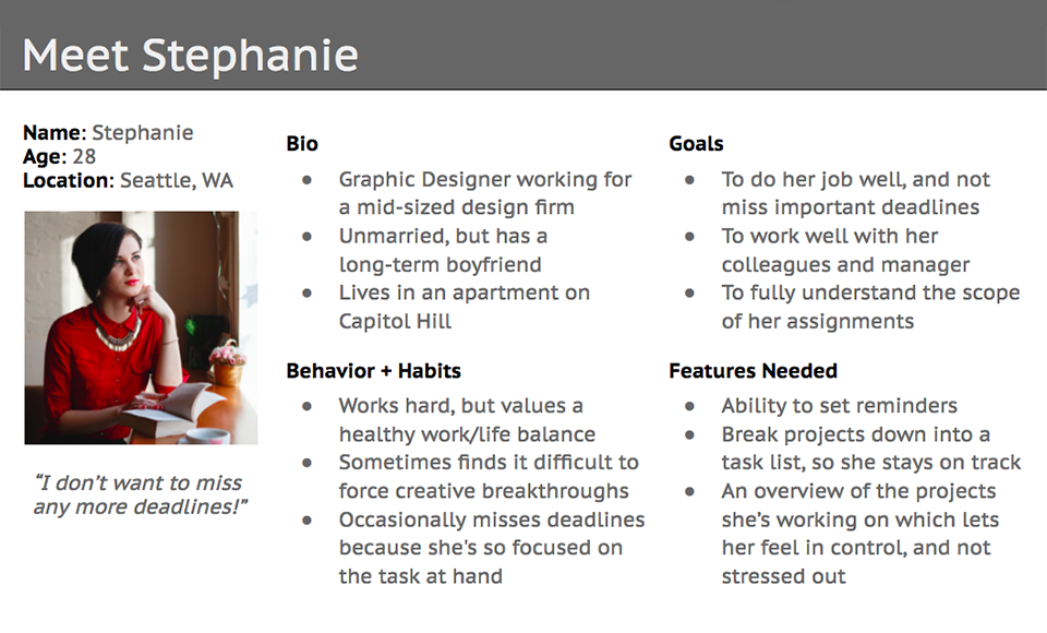
Persona
A Persona is essentially who are we designing for. It's how we communicate data about the people who represent a major user group for our client's product. Having a deep understanding of users is fundamental to creating exceptional software. Personas help to prevent self-referential thinking, so that you don't design a product just for your own needs or biases. The Persona we developed from our research is Stephanie.
Plan
I took the lead during our Plan / Information Architecture phase. I was most familiar with the results of our Usability Testing, and I enjoy analyzing data in order to gain user insights. Looking at the results, I was able to discover what was most important to Stephanie, and create a visual hierarchy to support those goals. It was important to decrease her cognitive load, so that she never felt overwhelmed with an onslaught of un-prioritized information.
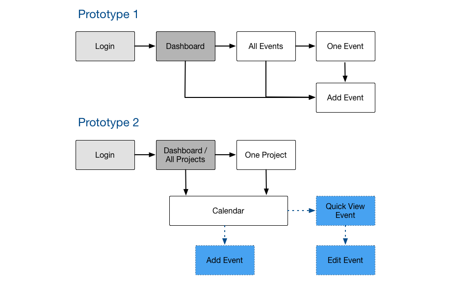
User Flows
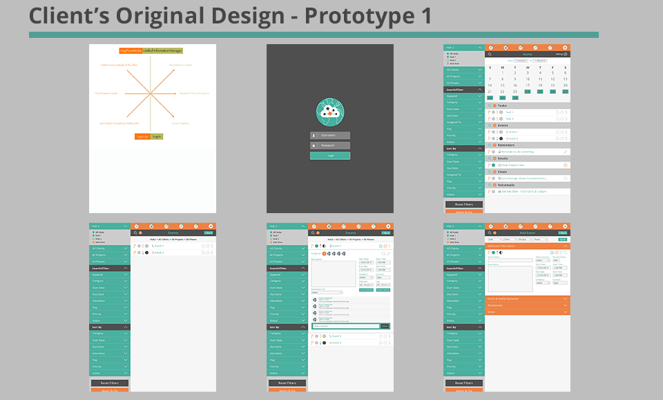
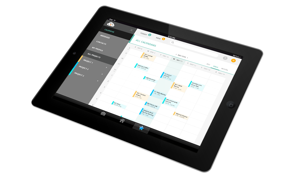
Much of my work focused on streamlining and simplifying the client's original Dashboard and Calendar views. These views were extremely dense with information, including icons and visual cues based solely on color (which introduces accessibility challenges). I created a User Flow, and we built an Interactive Prototype of the client's original design so that we could perform Usability Testing by having users perform tasks on a realisitic version of the tool.
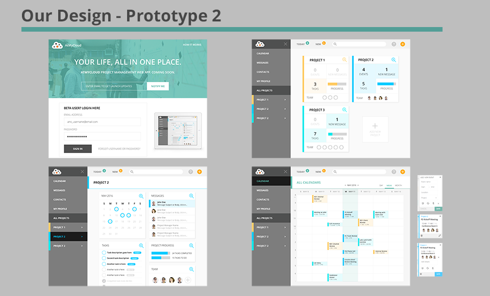
Once I determined what the goals of the product were, I developed a second User Flow that represented a clearer, more intuitive approach to managing projects and events. Then our team created an Interactive Prototype of the updated system to do more Usability Testing.
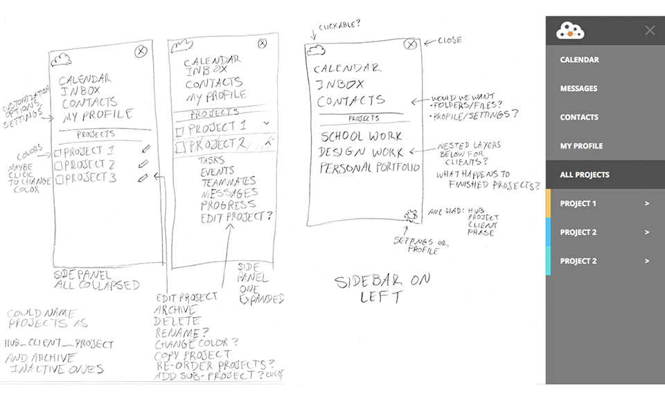
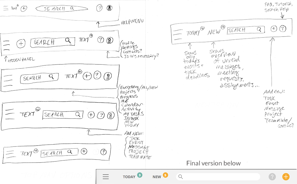
Navigation
I enjoyed the challenge of distilling the complexities of the original design into a simple, intuitive interface. Analyzing the data from our Usability Tests allowed me to prioritize which features would be most useful to Stephanie. I was particularly interested in determining how to reveal product functionality as Stephanie needed it, rather than overwhelming her with all of it at once.
Design
The structural design of Prototype 2 came under the umbrella of Information Architecture, so this was the area of the project that I led. I like using hand-sketched wireframes to rapidly iterate on ideas at low-fidelity. This allows me to dial in usable designs before spending time creating higher-fidelity mock-ups.
Sketches
I experimented with a number of different layout possibilities before aligning with my teammates on the one that looked most promising for the needs of our users.
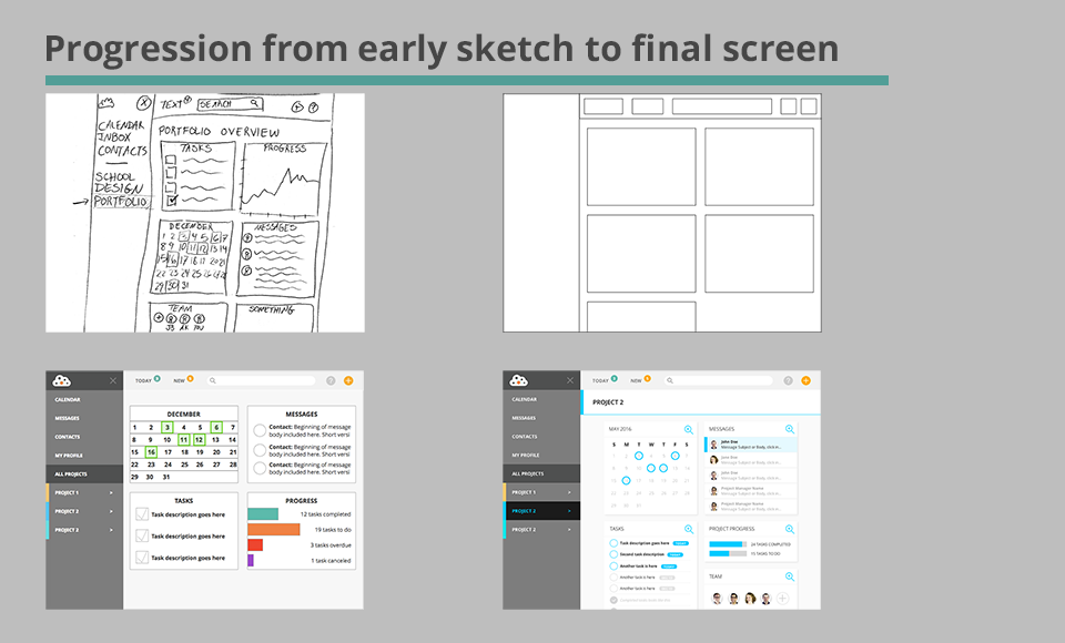
Wireframes and Design Patterns
Here's a small snapshot of the progress that one of our screens underwent during the design process. I created the sketch, the rough wireframe, and the low-fidelity version, then worked with my teammates to create the final Visual Design.
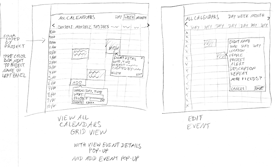
Interaction Design
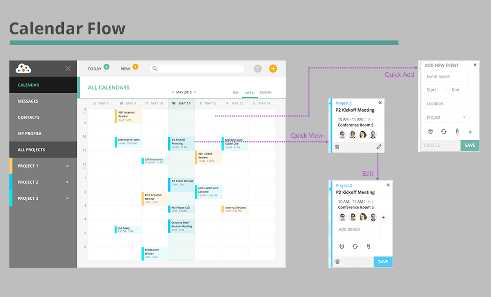
For the calendar pages, I created an Interaction Design that kept Stephanie on the same screen for viewing, editing, or adding events. This was based on feedback from our User Research, and this feature proved to be very popular in our later Usability Tests. One of our best comments during the Usability Tests came from a user viewing this Calendar screen, who said, “This is really easy to use. I use Google Calendar and I hate that it takes you to a different screen. It would be easier if it did this, and you didn't have to switch screens.”
Test
Usability Testing was a large part of this project. We conducted both in-person and remote Usability Tests for each of the two Prototypes. We learned quite a bit from both the process and the results of those tests. I wrote the scripts for each type of testing, and conducted all of the remote testing personally through UserTesting.com. In addition, I created a spreadsheet that allowed our team to analyze data from the tests easily across each task or question.
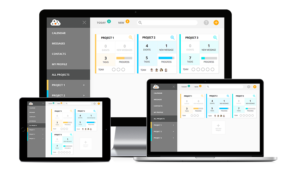
Below you can see the two prototypes that we tested - the client's original design, and our re-design.
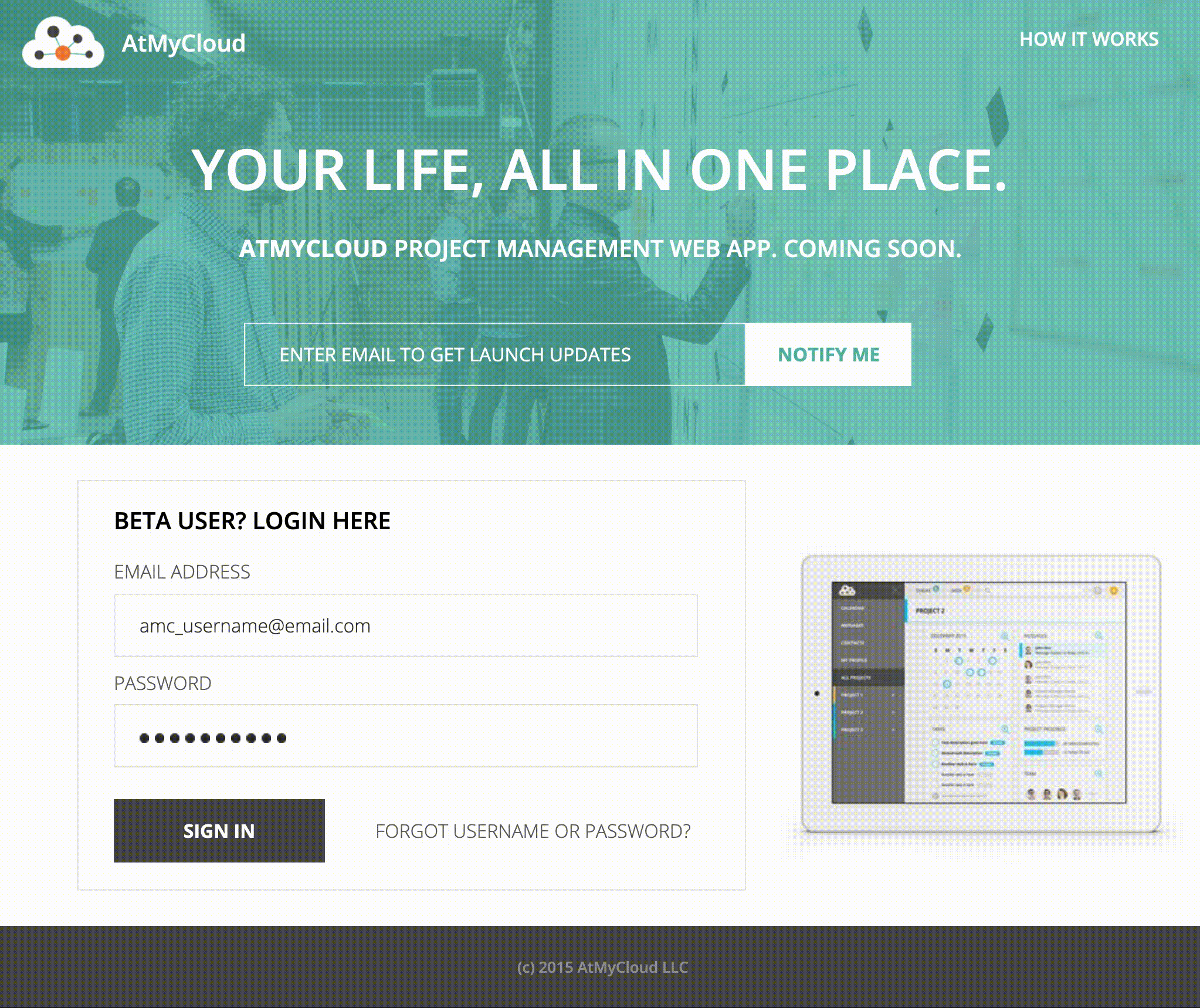
Client's original design - Prototype 1
Our re-design - Prototype 2
Usability Tests
Users' overall impressions of Prototype 2 were very positive. They felt that this design looked current, clean, and well-organized. They found the navigation to be clear and easy to understand. They appreciated how it didn't overwhelm them with information, but instead kept things relevant and prioritized.
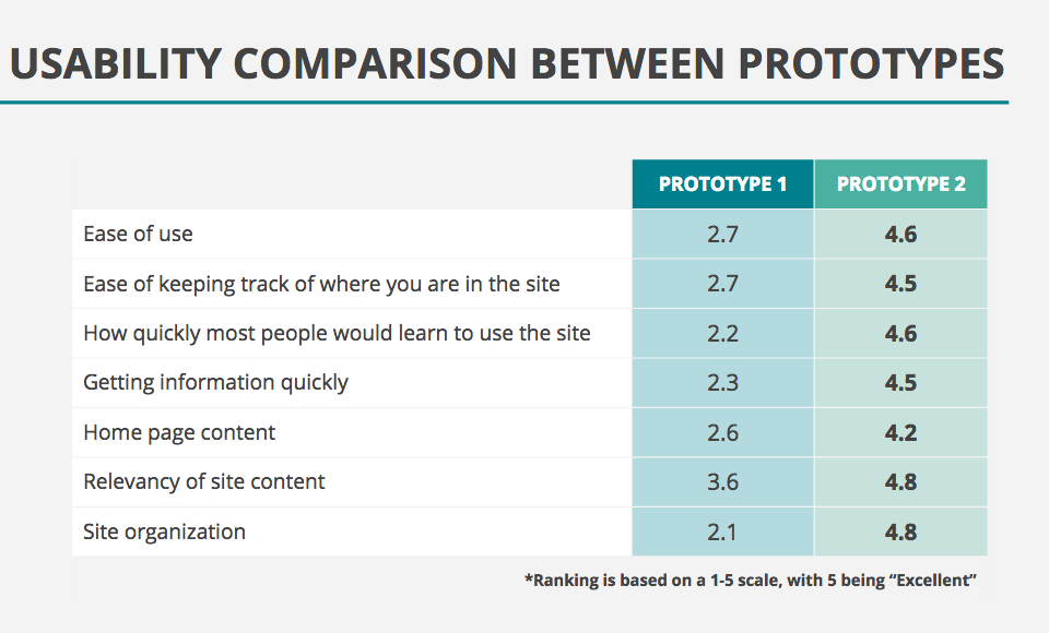
At the end of each Usability Test, we asked the user to rank the Prototype they had just viewed on a scale of 1 to 5, with 1 being poor and 5 being excellent. These were the results. It's clear that Prototype 2 was a much more positive user experience than the original product.
Result
At the end of this project, our team was able to present the following deliverables to our client, and they were well-received. Our client was particularly interested in learning more about the results of our Usability Testing, since that was something his company had never done before.
• Competitive Analysis
• Heuristic Evaluation
• User Flows
• Persona
• Usability Test Scripts, Screeners, and Consent Forms
• Usability Test Plan
• Two Interactive Prototypes
• Detailed documentation of the Usability Test Results
• Video Highlight Reels of the two rounds of Usability Testing
• New product design based on our User Research and analysis of the Usability Testing
• A detailed list of Client Recommendations
• A slideshow Presentation outlining our process and results
We kept in close touch with our client throughout this project, sending him daily updates, and setting up meetings with him at key decision points. Our final Client Recommendations included well-documented and researched suggestions that will improve the viability of his product in the marketplace, including:
• Aim for a clean, uncluttered dashboard
• Launch the new website home screen that we designed
• Implement our navigational improvements
• Allow users to stay on the same screen whenever possible
• Take an in-depth look the competition, especially Asana and Basecamp
• Iconography and word-choice should follow industry standard conventions
• Be sure to include Help documentation
• Take tablet screen needs into account, so that interactions are clickable or touch-based
• Create a responsive design rather than separate mobile, tablet and web products