Every Drop
Mobile app concept
Overview
How can we help people save money and conserve water?
This was a 2-week student project with a team of three designers.
Seattle Public Utilities believes that increasing customer awareness of their personal water usage through Smart Meters will make voluntary water conservation efforts more effective. Smart Water Meters are being installed in homes throughout King County, Washington. These meters have the capabilities to monitor usage down to the hour, and a learning algorithm on the meters can associate vibration signatures with specific plumbing fixtures.
Solution
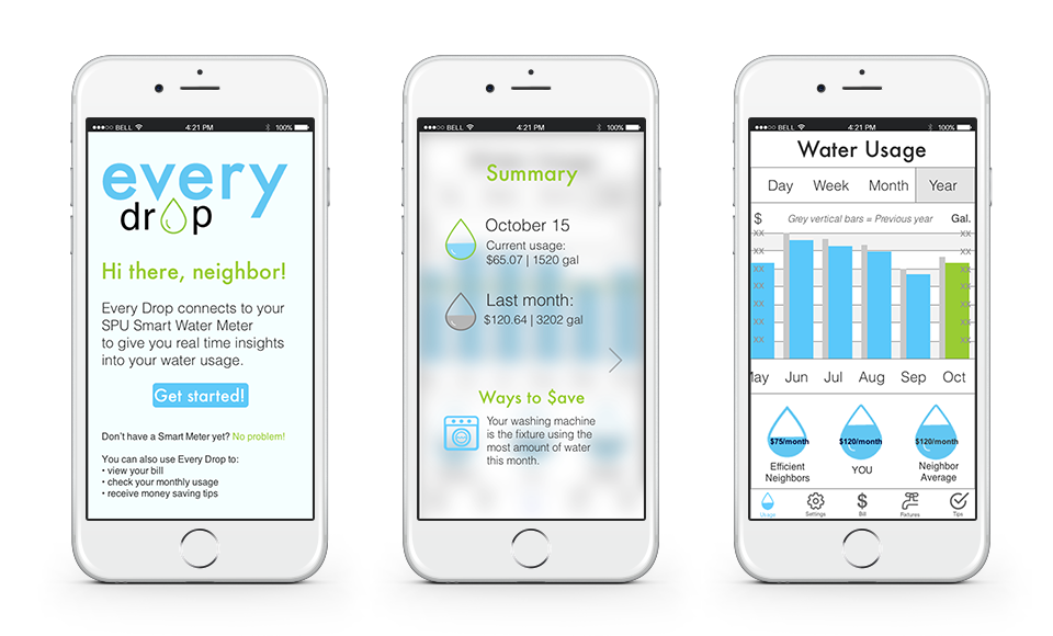
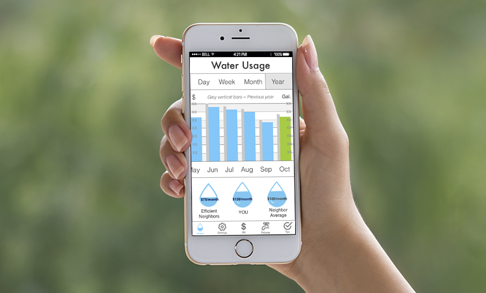
Our team designed an interactive prototype of a mobile app that would let SPU customers access the data from their Smart Meters. This would give them more transparency about their water usage, and they would be able to use this knowledge to make more informed decisions about their water conservation efforts.
- Role: UX Designer, Information Architect, Data Visualization Lead, User Researcher
- Tools: Axure, Illustrator, Photoshop, OmniGraffle
- Timeline: October 2015 (2 weeks)
Research
Our team enthusiastically jumped into the research phase, conducting User Interviews, and digging deep into Domain and Organizational Research about Seattle Public Utilities (SPU) and successful water conservation programs worldwide.
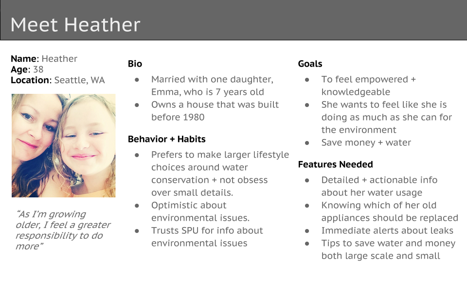
Persona
We conducted 13 User Research interviews over 2 days. This helped us understand our users' relationship with SPU, their water bills, and their attitudes and knowledge about water conservation. We used Affinity Diagramming in order to understand our users' mental models, and create a Persona from the data gained during our interviews.
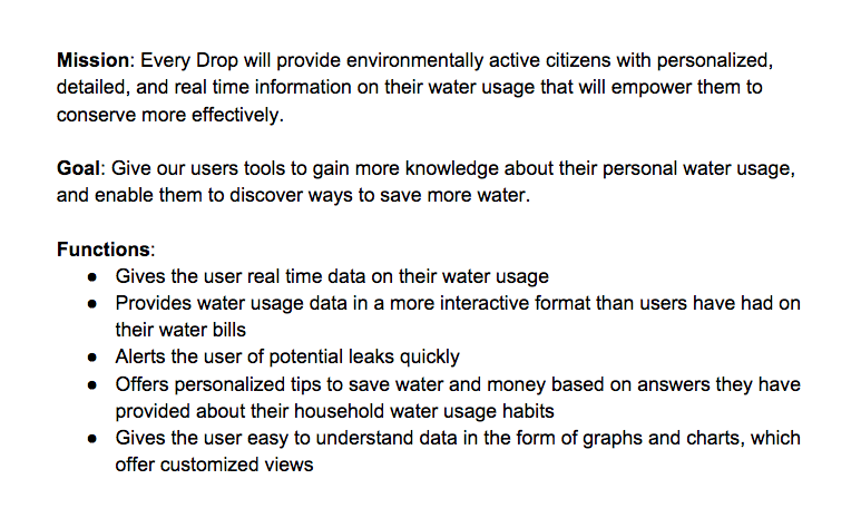
Project Summary
Working together to create a Project Summary allowed us to get to the heart of Heather's behavior, motivations, and needs. This exercise enabled us to have a clear understanding of her goals, and use that to drive the design of our app.
Plan
I took primary responsibility for a number of the tasks during our Planning / Strategy phase of our project, including Use Cases, Sitemaps, User Flows, Content Inventory, and our Navigation System. Each of these steps is crucial to my Information Architecture process – I love how they help me to think through the details of a user's path through our app.
Project Plan
On our first day of working together, I created a Project Plan spreadsheet for our team, and we filled it in together. This document allowed us to determine who had the primary responsibility for each task, set deadlines, prioritize tasks, and keep track of our deliverables. It made the whole team feel organized, and kept us on track.
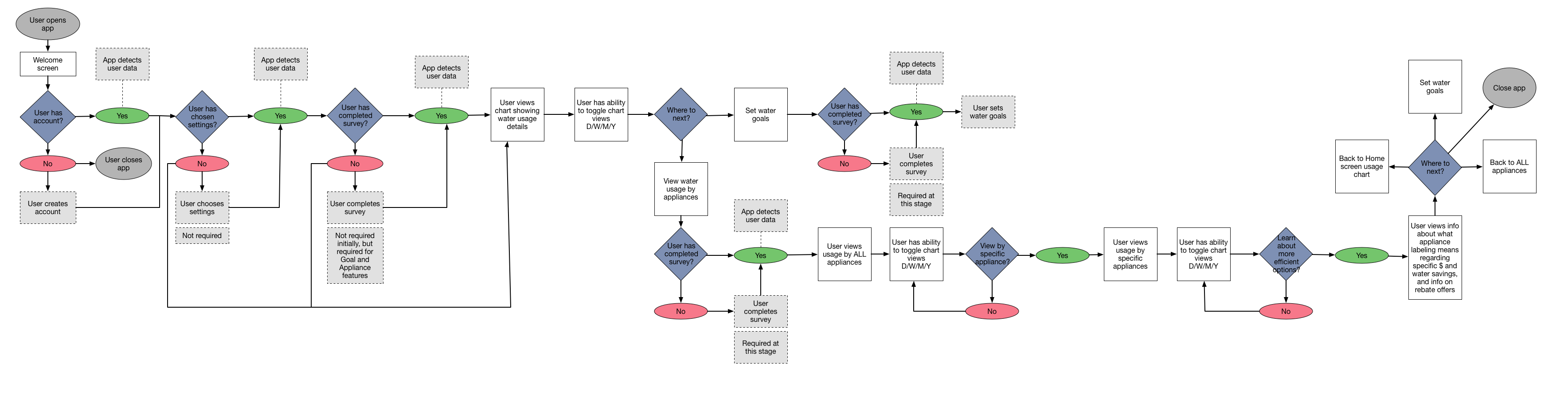
User Flows
I produced multiple versions of our User Flow during the UX Design process. This exercise really helps me to understand the structure of the app and the necessary parts. The initial versions were sketched out by hand, and the more refined versions were created in Omnigraffle. Usability Testing gave me additional insights into what worked best for our users, and led to further changes to the User Flow Diagram. (Click the image below to expand it)
Design
It was valuable to see how each of us approached the visual design process. We found it to be a rewarding challenge to merge together different ideas and visual styles into one cohesive design.
Sketches
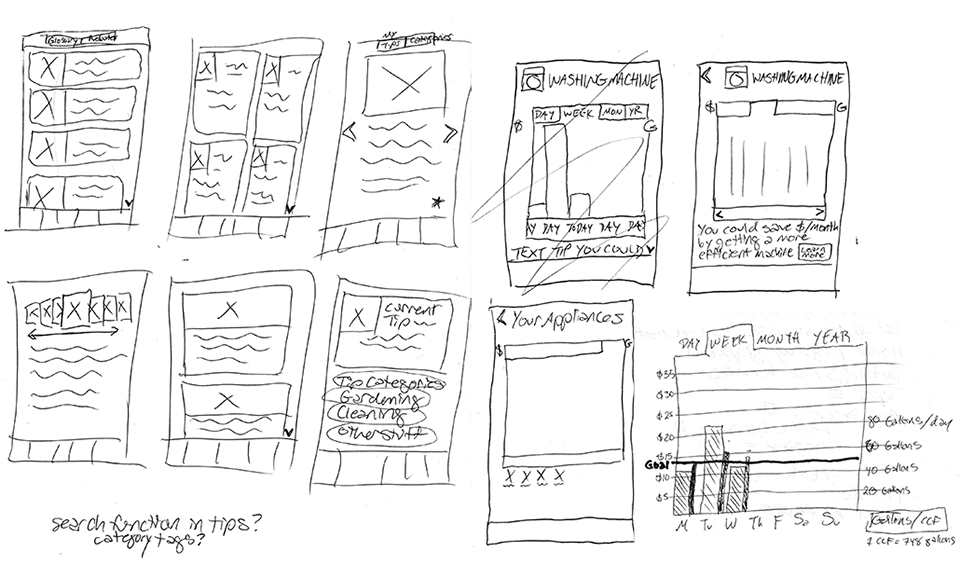
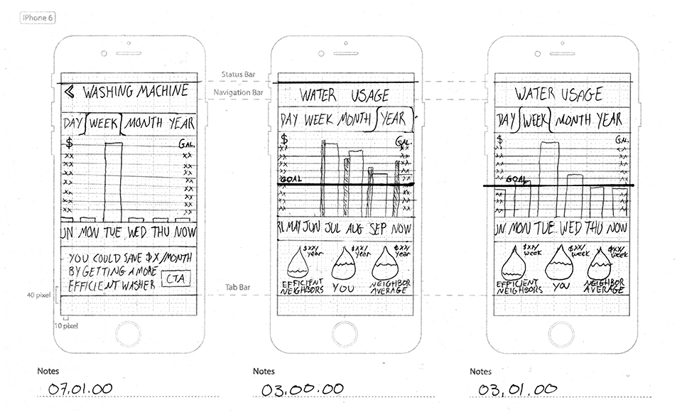
We made time to have a full day of Sketching, working on Layouts, and Design Patterns together. This gave us time to explore different visual ideas on paper before we moved onto prototyping in Axure. Data Visualization is an area I'm particularly excited about, so I led the design process for each of the screens with graphs on them. A selection of my sketches are below.
Rapid Prototyping
After considering many different visual approaches, we settled on the Design Patterns we would use. We compared the sketches against the Sitemap I had created to make sure we had created Layouts for each screen that we needed. Rapid Prototyping gave us the ability to test out our Paper Prototype before building the higher-fidelity screens in Axure.
Test
We started Usability Testing at the beginning of week 2 so that we'd have time to consider, analyze, and implement the changes. Our team conducted 7 Usability Tests, and gained valuable, actionable insights from each test. This gave us the opportunity to rapidly iterate and improve our design before our deadline.
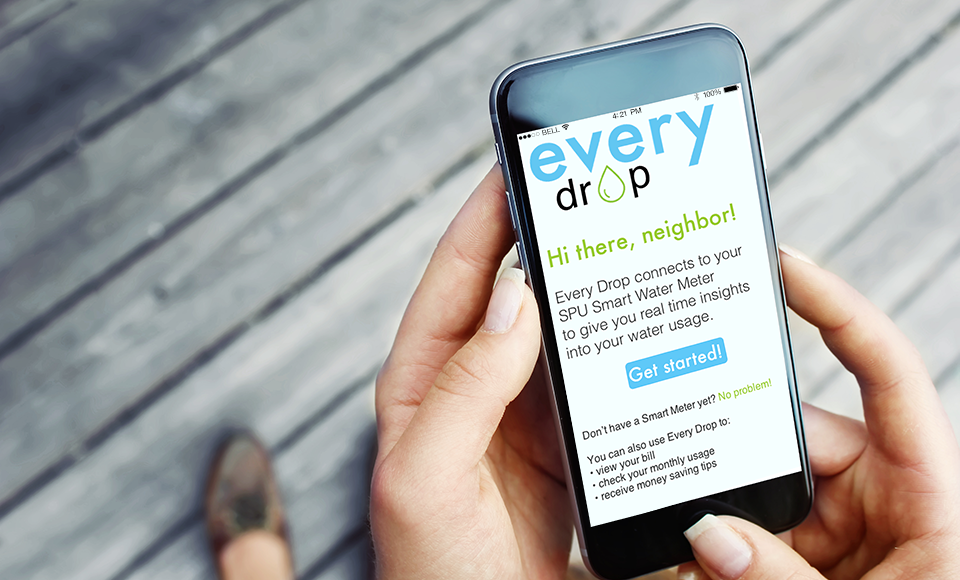
Below is the prototype that we created in Axure.
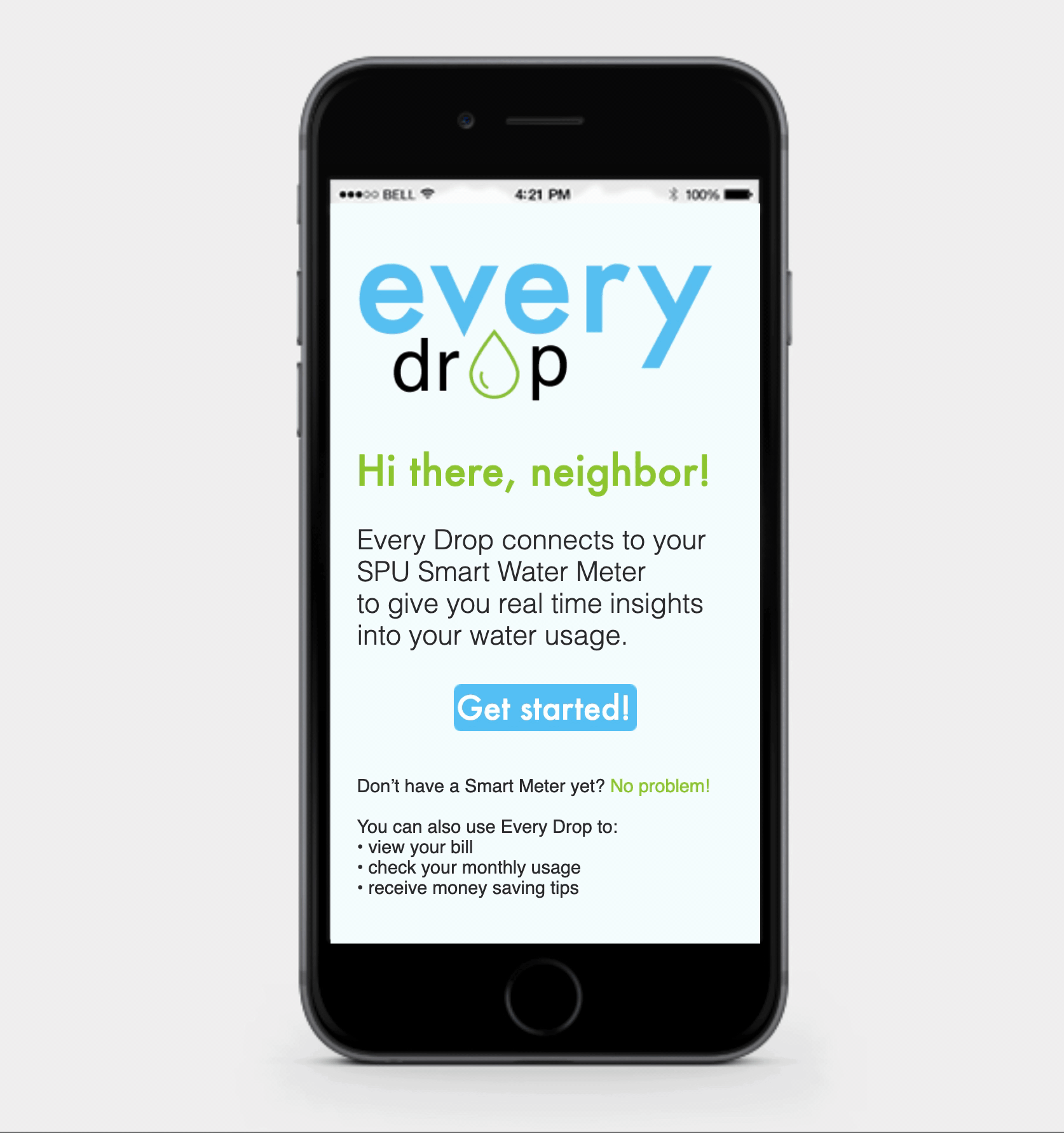
Result
Our team created an app that would give our users tools to gain more knowledge about their personal water usage, and enable them to discover ways to save more water. This app met the needs of our Client Brief, and exceeded the expectations of our teachers.
Here's my favorite quote from our Usability Tests: “You made utilities fun! I didn’t think anyone could do that!”
If this app were to be launched, I would measure its effectiveness using the following success metrics. Quantitative: amount of overall residential water usage reduction, number of water-efficient appliance rebate applications received, number of downloads, frequency of use after download, and number of user reviews. Qualitative: content of user reviews, overall user satisfaction, users feel more informed as a result of using app, likelihood of user to recommend to a friend.